A responsive website: What it is and why it's important for online success
Published by Incomedia in Web design · Thursday 14 Dec 2023
It happened to me the other day. I was at the supermarket, I saw some beautiful pumpkins and felt like cooking them. Not being an expert chef, I thought it might be better to search online for a recipe. So I parked my trolley, took out my cell phone and did my research. Among all, there was a site that seemed promising so I opened it but eventually I had to give up. The page was crowded with content, text that was too small and links that were difficult to click on. Basically, it was pretty obvious that it wasn't at all suitable for mobile browsing.


What a shame! I lost a recipe I quite liked (even if I did find another delicious plate on a competitor site), and that site lost a reader.
I'm sure something similar has happened to you as well. In fact, it's never fun for users to stumble upon a website that doesn't support mobile browsing. But from the website owner's point of view, it's a much more serious problem since it can have devastating consequences on the success of an online initiative.
The solution? Creating a responsive website with the ability to seamlessly adapt to viewing on any type of device, including desktops, tablets and smartphones.
If you don’t really know what responsive design is, or if you'd like to learn more about the topic in order to improve your website, continue reading. In this guide, we'll discuss:
- What a responsive website is
- The differences between a responsive website and an adaptive website
- Why it’s extremely important for a website to be responsive
- Benefits of a responsive website
- How to create a responsive website
- Mistakes to avoid when creating a responsive website
What a responsive website is
It is quite simple to check whether a website is responsive or not. If you're on desktop, try making the browser window smaller. Does the site still look good or does everything shrink to the point where zooming in becomes necessary?
👍 Scenario 1: The website is responsive. Well done!
👎 Scenario 2: The website is NOT responsive. There's work to be done here!

Simply put, a responsive website is a site that automatically adapts to the screen size of the device it's accessed on.
This means that when you open a responsive website on a desktop, smartphone or tablet, the layout and size of the content adjusts dynamically to provide an optimal experience in every situation. Basically, when switching to lower resolutions, you will see some page elements resize, others will move or (the non-essential ones) disappear, but the point is that as the space is reduced, the page will continue to offer all the necessary content in the best possible way.
The differences between a responsive website and an adaptive website
Over the years, as smartphones and the ability to remain connected have increased, the need to make browsing on mobile devices as easy as browsing on desktops has become increasingly important.
There are now two alternative approaches which allow you to control the appearance of websites on various screens:
- Responsive design
In this scenario, you create a single website that's capable of adapting the content to the screen size. This design is based on the width of the device and offers a smooth transition between different screen sizes. When someone accesses the site, the browser recognizes the type of device, and the template responds with a suitable design. - Adaptive design
In this scenario, different versions of the same site are created, each specific to a device. For example, you could have a separate layout for desktops, tablets and smartphones. When you access the site from a device, the server detects its type and loads the appropriate version of the website.

Adaptive websites certainly offer greater control over the appearance and functionality of pages at each resolution, but they do have some limitations. They are more cumbersome and more difficult to maintain. Any update, in fact, will need to be duplicated on each of the site's version, and if new devices arrive on the market, it'll be necessary to evaluate the development of as many new ad hoc versions. Then there's the fact that the website's various versions inevitably present duplicate content, which - as well all know - Google doesn't like.
For these reasons, except in cases with very specific needs, creating a responsive website is the most popular and widely-used choice. The result is less cumbersome, and managing the website on different platforms is easier.
Why it's extremely important for a website to be responsive
To allow you to evaluate how important it is for the success of your online business to have a responsive website, here's some data that gives an idea of it’s purpose.
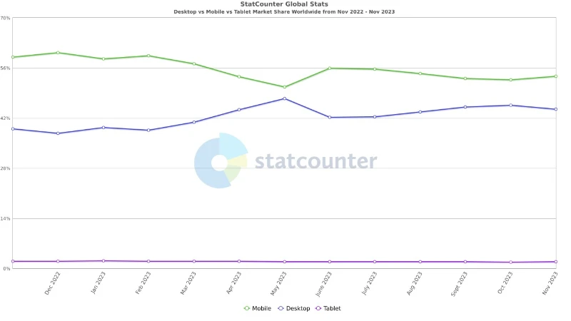
Mobile traffic is now more popular than desktop traffic
Experts predicted this, and it seems they were right. Currently, with a few differences from country to country, 55% of online visits worldwide come from mobile devices, 43% from desktops and 2% from tablets.

Mobile commerce is consistently increasing
In 2017, 58.9% of online sales were completed on mobile devices. In 2021, mobile-commerce had already reached 72.9%, and its growth doesn't seem to be stopping.
Users spend less time on a mobile site than on a desktop site
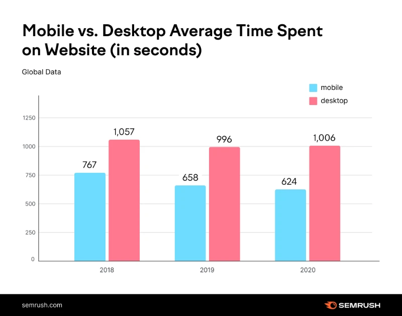
With all the information we have access to every day, our attention spans tend to be shorter and shorter. Additionally, when browsing on mobile devices, we tend to be in a greater hurry. As such,the time we spend on a website is 40% less on average, compared to when browsing on desktops.

Desktop users spend more time on a website than mobile users - www.semrush.com
What can we conclude from this data? Mobile devices are increasingly pervasive, and this allows us to browse, play and chat at any time of the day, regardless of where we are. Having a website that can't guarantee a satisfactory user experience when browsing on mobile is therefore a hindrance, especially if an e-commerce site is connected to it. Users expect to be able to browse and purchase from their smartphones, and they aren't willing to wait or waste time. Having a responsive website or e-commerce site that loads quickly and is effective in presenting information is an essential requirement for any initiative involving an online presence.
Benefits of a responsive website
At this point, it should be clear to you why it's important that your website is responsive. In case you still have any doubts, let's try putting together a quick list of the most important benefits you can gain from it.
- A large target audience: With a responsive website, you can reach users on mobile devices, tablets and desktops. This diversification of your audience can increase traffic to your site and, consequently, conversion and sales opportunities.
- An improved user experience: With a responsive website, users don't have to zoom or scroll horizontally to view content, and texts and images are always perfectly readable and appropriately displayed. This translates into more satisfied visitors, longer retention times and greater overall engagement.
- Reduced visitor abandonment rates: With non-responsive websites, people often encounter navigation issues or slow load times, so they're more likely to leave the site and look elsewhere. A responsive site, on the other hand, significantly reduces the risk of losing potential visitors and keeps users on the site for longer periods of time.
- Best positioning on search engines: Search engines like Google reward sites that offer visitors the best user experiences and, consequently, give priority to responsive websites in search results. This means that with a responsive website, you have a better chance of obtaining a better position in search results, increasing the visibility of your website and attracting more visitors.
Mobilegeddon
April 2015 - Google decides to penalize non-mobile-friendly sites by lowering their rankings. And it hasn't stopped since. There's even a tool for verifying whether or not your site is mobile friendly, and it provides suggestions on resolving any issues.
- Cheap, sustainable and manageable: A responsive website requires fewer resources to manage than a site with separate versions for different devices. Furthermore, you don't need to create and maintain multiple versions of your website, which simplifies the process and makes it more sustainable and easier to manage.
In short, a responsive website not only improves the user experience but also offers concrete advantages in terms of visibility on search engines, audience engagement and more efficient management. So whether you run a business, a blog or a personal website, investing in a responsive website is an essential step to your online success.
How to create a responsive website
You'd probably prefer not to have to do this, but to fully understand what it means to create a responsive website, you need to understand some rather technical concepts. But don't worry, this doesn't mean that you'll need to learn how to program.
Are you ready? Let's go!
Responsive design uses a combination of HTML and CSS and is based on three distinct elements: a fluid layout, flexible images and text and media queries.
HTML is the language used to control the structure, elements and contents of a page.
CSS (Cascading Style Sheets) are style sheets used to modify the design and layout of the included elements.
A fluid layout assumes that element sizes are not fixed or static. This is what allows the site to appear larger or smaller, depending on the size of the user's device.
Flexible images and text, i.e., those that are not defined statically, are elements that can vary in size and can also appear or disappear depending on the device.
Media queries: These are statements that ensure that the fluid layout, images and flexible text appear correctly.
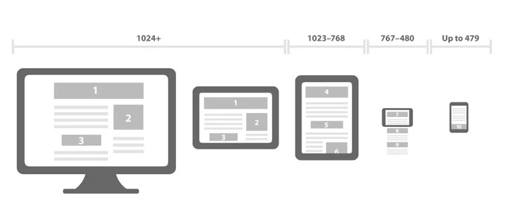
In practice, with responsive website design, the HTML code always remains the same, but media queries ensure that different parts of CSS are applied when the site is displayed on different screen sizes. To do this, they use breakpoints which are established interruptions based on the most common screen sizes of various devices. Each breakpoint, therefore, establishes a screen width for which a media query is used to implement a specific CSS.

It's like saying this is the web page (created by HTML); for resolutions higher than 1024 pixels (example of a breakpoint for desktop), display the content like this (defined through a given CSS); for resolutions between 768 and 1024 pixels (example of a breakpoint for tablets), change and use this other view (other CSS); and finally, for resolutions lower than 768 pixels (example of a breakpoint for mobile), it changes again (other CSS). With a unique code and three sets of instructions (i.e., media queries), we achieve the desired result: a site that adapts to the size of the device screen.
Now that you understand how this works in principle, you'll be able to better understand what to do once you have identified the tool for creating your website. You'll be asked to make choices on how to manage the entire part that's related to viewing pages via mobile.
With WebSite X5, for example, all templates are already mobile optimized and handle the most common breakpoints. You are, however, free to edit, add or remove breakpoints as well as customize templates to various resolutions. Always working visually, you'll begin by insert content onto the pages. You'll then also be able to manage their display in the various breakpoints, ordering them and hiding them when not necessary at lower resolutions.
The beauty of working with software like WebSite X5 is that it solves all the issues related to code development, helps you manage breakpoints and make the necessary decisions. Furthermore, which is no small feat, it takes care of optimizing the images and code without you having to do anything in particular, allowing you to have agile and fast-loading pages.
Are you interested in learning more about creating a responsive website with WebSite X5? We've put together some guides that explain everything you need to know.
Mistakes to avoid when creating a responsive website
No matter how hard you try, sometimes mistakes happen. When creating a responsive website, there are some rather common mistakes that are important to avoid in order to guarantee an optimal user experience on all devices.
Here's a list of mistakes you should keep in mind, so you can avoid making them:
- Images that are too heavy: High-resolution, non-web-optimized images slow down page loading on mobile devices. Make sure that images are compressed and saved in appropriate formats, such as JPEG or PNG to reduce website loading.
- Text that's too small or too large: The text must be readable on all devices. Avoid using fonts that are too small and that require zooming in to read or fonts that are too large and that force users to constantly scroll horizontally.
- Complex navigation: Overly complex navigation or menus that are not optimized for mobile devices (hamburger menus) can make it difficult for users to find what they need. Keep navigation clear and user-friendly.
- Ignoring touch buttons: Make sure the buttons are large and sufficiently spaced to allow easy interaction even via touch screen. Users should be able to select buttons
- Non-essential content: Users hate wasting time, so avoid overloading pages with unnecessary elements, such as heavy scripts or invasive ads.
- Not testing on various devices: Display and usability issues can vary greatly between various smartphones, tablets, and browsers. Be sure to test on a wide range of devices to ensure that the site works properly everywhere.
- Not monitoring performance: A responsive website should load quickly on all devices. Ignoring website performance is a common mistake. Use performance analysis tools and optimize your code to reduce load times.
In closing
"Well, I already have a website and, based on access statistics, I know that only 10% of visits come from mobile. Why should I bother making it responsive if most of my users can see it correctly anyway?”
Good question! Instead of focusing on the 90 users who peruse via a desktop or on those 10 who, despite "sketchy" navigation, still access your site from mobile, try to think about how many visits you've lost because your website is not responsive.
How many users browsing on mobile have stopped visiting your pages in favour of the competition? How many haven't even found your site because, not being optimized for mobile, it doesn't rank well in search engines?
I agree. Creating a responsive site requires more effort, but with a tool like WebSite X5, it's a task within everyone's reach. Above all, it's an absolutely profitable investment.
In conclusion, in an era where access to the digital world occurs through a variety of different devices, the creation of a responsive website is no longer a choice but a necessity since, as we have demonstrated, it can make all the difference between the success and failure of any online initiative.

