Creating powerful contact forms: Ten things you can do to increase the number of your subscribers
Published by Incomedia in WebSite X5 News · Thursday 21 Apr 2022
In spite of what they say, email marketing is alive and well. In fact, as we had the opportunity to say in one of our previous posts (An irreplaceable evergreen. Five great reasons why you too should be doing email marketing), it’s in excellent health.
Have you too been thinking about using this extremely effective promotional tool? Great, so you’ve already been planning to include an email form on your website so you can gain subscribers to whom you’ll send your communications and offers.
But how can you create a truly powerful form, a form that’s capable of populating your list of qualified contacts in a reasonable amount of time? Let's find out together.
Best practices for contact forms that work
If you’re looking to collect contacts or, as those in the industry like to call them, “leads”, it’s not enough to simply insert an email form on just any page of your website and sit back and wait.
Think about what you do when you’re browsing and come across a form. I bet you don't provide your information for just any reason. Instead, you decide to fill it in only if what you’ve found on the site has convinced you that enrolling will provide some type of benefit, and that this benefit is enough to reward you for the time you’ll spend answering the questions.
To ensure that your form truly convinces your website visitors to give you their contact information, you're going to have to try a bit harder. So here are the ten things you’ll need to do to be successful at increasing your number of subscribers:
- Introduce the form at the appropriate time
- Make the form visible but not intrusive
- Create a context for the form
- Ask only the questions you need to
- Use appealing copy
- Make the form visually pleasing
- Always keep it simple
- Provide feedback to users who’ve filled out the form
- Comply with GDPR
- Use A/B tests for continuous improvement
Introduce the form at the appropriate time
When users see your form, they should be at least interested in your offer. You can't expect them to fill it out if you haven't first explained to them what you do and why they should choose you over someone else.
Try to create a navigation path within your site to welcome your users and lead them gradually to discover what you do or offer. It’s only after you’ve won their interest and trust that they’ll be willing to fill out your form and click on the "Submit" button.
Make the form visible but not intrusive
We've said it before - the form is important to you. That's why it wouldn't make sense to hide it or make it inaccessible. Therefore, you’ll always want to place it in a prominent position, so that it’s more likely to receive traffic. Give preference to the portion of the page above the folder (the upper part that’s visible without scrolling) and also consider repositioning the form on various parts of your site, depending on the navigation paths you've created.
However, you’ll need to avoid making the form too intrusive, for example, by putting it in a large pop-up that aggressively interrupts the user. It's unlikely that an annoyed user would be inclined to provide you their information.
Create a context for the form
Now that you’ve determined the appropriate page on which to insert your form, how should you present it? You can't display it full screen. You need to create a context that guides users to the form and breaks down their barriers by compelling them to fill it out.
Creating a context means focusing on the copy and images surrounding the form within the web page. Regarding the copy, you might provide:
- a thank you for their interest
- an explanation for the purpose of the form that makes it definitively clear to users why it’s important for them to fill it out
- an indication of the time required to complete the form to give users an idea of the commitment you’re asking for
Additionally, according to website design rules, inserting an image next to the form can be advantageous, being a way to add emotion. Choose your image carefully. It should be high-quality and in line with what you’re offering. In many cases, an image of a person is a good choice because it can reassure and create an emotional connection.
There’s another element that should be included near the contact form: a list of alternative contacts. Do your users prefer to email or telephone you? Why not accommodate them? Here are all the alternative contacts you might consider offering:
- email address
- landline and mobile phone number
- Skype username
- Live Chat if applicable
Ask only the questions you need to
Asking users to fill out a form means asking them to commit some of their time to performing a task that isn’t particularly appealing to them. The chance of them doing so is greater the more you ensure that the task is quick, easy and painless.
So keep the questions to a minimum and include only the ones that are truly necessary.
Many forms are extremely basic and simply ask for the following: name, email address and purpose. Upon closer inspection, of these, the only required field is email. Requesting a name is optional.
If you’re happy with a name and an email address, you might be able to collect more contacts, but you would know little about each one. If, on the other hand, it’s important to you to better qualify each contact, you can ask more questions. You’ll end up with fewer but more complete entries.
In this second case, a good rule is to include one to three questions for each of these sections:
- Contact Information: Includes fields such as name, email address and telephone number.
- Business information: Allows you to better understand who you’re dealing with. Examples of these fields include company website, business activity and main contact.
- Project Information: Allows you to correctly frame the request. Examples of these fields include: project type, budget and estimated timeframe.
If there are many questions and the form gets too long, divide it into sections so it seems more manageable to the user.
Now, deciding how many and which questions to ask is up to you in relation to the types of goals you set for yourself.
Use appealing copy
Writing copy for a form sounds easy, but those in the industry know that writing microcopy is more difficult than writing volumes of copy. When you need to say a lot in only a few words, you really need to make sure you choose the right ones.
Fortunately, for most fields on a form, you don't have to come up with innovative solutions. Instead, you can replicate what you generally find online. This has the advantage of asking users questions they’re already familiar with and are therefore easier to deal with. So, if you’re asking for an email address, naming the field "Email" will be obvious, but it’s also the best choice.
Another issue comes with the introduction of formulas or CTAs (Calls To Action) on buttons, you’ll need to go beyond the standard wording. More creative formulas than the standard "Sign Up," in fact, lead to better results. The trick is to use phrases in which the user's advantage is explicitly highlighted, such as “I want to stay updated" or "Receive the latest news". Here, you should give it your best effort.
Make the form visually pleasing
The same care and attention that you devoted to composing and formulating your website graphics should be used in designing your contact form.
On their own, forms are not particularly attractive, but by paying close attention to things like colors, fonts and the spacing between elements, you can accomplish a lot. Above all, you can ensure that the form is consistent with the rest of your site.
Don't underestimate anything. You'd be surprised how much better a form’s subscription rates can be just because the color or look of the "Submit" button has changed!
Always keep it simple
Surely you’ve figured it out by now. If you want users to fill out your form, you’ll need to reduce all possible issues and try to make the task as easy as possible for them.
This means not just figuring out the number of questions, copy or length of the form (things we've already discussed), but also choosing the best way to allow the user to reply.
There are several things you can do when deciding which fields to use. For example, you can:
- include appropriately sized text fields for more discursive questions
- take advantage of drop-down fields to facilitate choosing between various options
- provide a calendar for dates
- activate automatic checks on the correctness of some fields, for example, to verify that e-mail addresses are written correctly
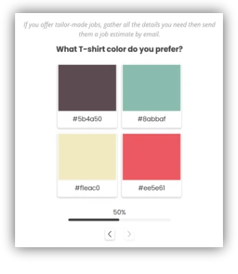
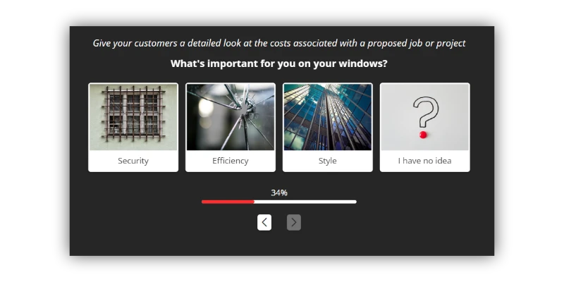
Here’s a unique and effective alternative to the usual fields. With Image Form Objects, you can create short questionnaires with closed questions and visual answers, collect user responses and information and respond with personalized offers and quotes. See them in action and discover how to use them correctly.
Provide feedback to users who’ve filled out the form
You got what you wanted. The user has filled out the form and has sent you their information. Out of politeness, you’ll want to thank them for their time and attention, and the best way you can do that is by directing them to a special thank you page.
With a thank you page, you can also:
- tell the user that their information has been sent successfully
- reassure the user regarding the timing of an eventual response from you
- guide the user on how to continue browsing your site
- set up tracking to monitor conversions
Comply with GDPR
Since forms are tools through which user data is collected and submitted, they need to comply with GDPR (i.e., General Data Protection Regulations).
Our advice is, of course, to thoroughly inform yourself regarding the applicable regulations to ensure your compliance and avoid the risk of sanctions.
In general, European legislation requires that:
- When personal data is processed, the user is informed of the processing activities carried out through a privacy policy.
- In order to proceed with data collection via a registration form, the user's informed consent is first obtained.
Consent must be explicit and verifiable, and the user must be guaranteed the right to revoke it. This is why you must always provide a cancellation link.
Creating your form with WebSite X5 gives you the option of linking to your privacy policy and inserting the link for deletion directly at the bottom of the fields. You can also easily require double opt-in to fulfill your obligations. Read the guidance available on the Object Contact Form.
Use A/B tests for continuous improvement
Finally, remember that everything can be perfected and that we never stop learning. So after you’ve created your form, published it online and begun collecting contacts, don't rest on your laurels. Instead, ask yourself what you can do to make it even better.
An A/B test is an experiment in which you compare two alternatives to see which one performs better. Place alternative CTAs, positions and colors in competition with each other and see what works and what doesn’t. Results won’t be long in coming.
Conclusion
At this point, you know what you need to do to create a form that’ll convince users to provide you their information. Soon you’ll have a list of e-mails at your disposal, and you can begin sending informative newsletters, quotes, sales offers or any other kind of communication you’re planning.
Have you already written your first newsletter? If you have not yet done so and are a bit confused, you’ll find this article useful: Creating an effective newsletter: Tips and best practices.
Enjoy reading!