7 tips for creating headers that will make you say, “WOW!”
Published by Incomedia in Guides and Tips · Thursday 11 Jun 2020
As they say, you don't get a second chance at making a good first impression. That's why you always need to be prepared to give everything you've got in those first few milliseconds - 50, according to a Google study - in which users form an opinion about your website.


But what will people who arrive on your home page see in those 50 ms? Most likely just the header. That's why the header is so important for your website's success, and why you need to make sure it's truly effective.
What is a header?
The header is the top part of a web page, and the first thing the users see without having to scroll down.
Think of it as a kind of calling card that you present to anyone who stumbles upon your pages: if they like it, or if it intrigues them, they'll continue their visit; otherwise, the users will exit your website and you'll have lost a potential contact to your competition.
This means that the header plays a strategic role. Creating a header for your home page is important because it concisely tells your visitors who you are and what you offer. You should also create separate headers for internal pages, which may be smaller and briefer, but remain consistent with the home page header. This allows you to better welcome visitors who start their visit to your website on an internal page rather than from the home page.
Why headers are important
Some of the clearest evidence about the importance of headers comes from studies on website usability by the Nielsen Norman Group.
According to these studies, when users arrive on a website, especially for the first time, they don't explore it very attentively or carefully; instead, they tend to quickly skim the page for hooks that grab their attention and convince them to spend more time on that site.
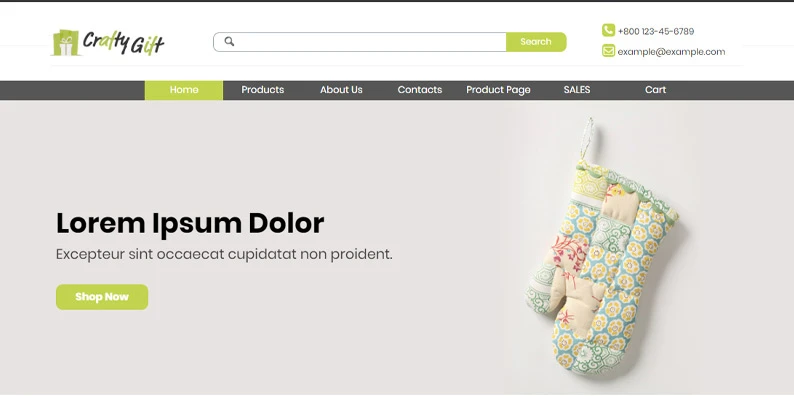
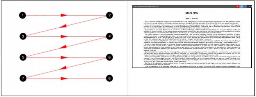
In general, readers skim web pages in the following ways:
The Gutenberg or zig-zag pattern: usually used for pages with a lot of different content. The reader’s eyes move from the top left-hand corner towards the bottom in a series of horizontal movements.
Z pattern: often used for websites without a strong content hierarchy. The reader’s eyes move in a Z pattern, in which 2 of the 4 active zones are in the top header.
F pattern: most commonly used when skimming web pages. The reader's eyes move in an F pattern, in which they read shorter and shorter amounts of each horizontal line as they move downward.
Without getting too far into the details of this study of these patterns, we can clearly see that the one thing they all have in common is that the top part of the page, namely the header, is the only part that is always read.
With that in mind, we can conclude that a well-designed header is an advantage for:
- your users → they’ll immediately find all the information they need to understand at a glance whether the website is attractive or ugly, and whether it's interesting and worth browsing more thoroughly.
- you, as the site owner → you’ll be able to convince more people to spend time on your website, allowing you to introduce yourself, present your services/products, and accomplish your business goals.
What goes into a header
As we mentioned, the header’s job is to sum up all the important information in just a few words, so that users can get an impression at a glance, and potentially decide to stay on the site.
In order to do this, headers generally include the following elements:
- logo and/or other branding elements
- navigation menu
- text and/or title that introduces the site’s topic/service/product
- button (CTA) that incites the user to complete a particular action (buy, sign up, subscribe, etc.)
- social media links
- contact information (telephone number, e-mail, etc.)
- language selection (for multilingual sites)
- search bar
- sign-up field
Of course, you don't necessarily have to include all of these in your header. Some of them, like the logo and the navigation menu, are crucial, while you may decide whether or not to include the others based on your needs and goals. Headers with too many or too few elements are less effective: it's up to you to find the right compromise.
Tips
The header is one of the sections where you can best express your creativity, but as we mentioned earlier, it's also a crucial element of a website. So don't get ahead of yourself, and make sure you channel your creativity in ways that are unique but also effective.
Here are some useful tips for creating a memorable header.
Define the dimensions
What should your header’s dimensions be? There’s no definitive answer: this mostly depends on your site’s goals and your own stylistic preferences.
Common sense suggests that the header's height should not obscure the site’s contents. For more informational websites, a smaller header could be a good choice: for a portfolio website or an online store, however, larger headers may be more effective.
If you decide to use a big header, make sure it doesn't take up the entire browser window: it’s helpful for users to be able to glimpse what's under it, which incites them to scroll down and navigate deeper into the website.
As we were saying earlier, you could create a large header for the home page as well as similar, but smaller, variants for the internal pages.
#ToDo: Large or small header? Decide based on your goals and the overall layout.
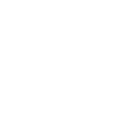
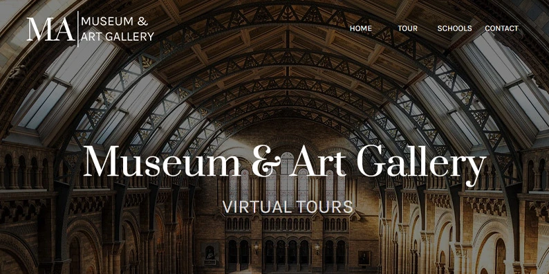
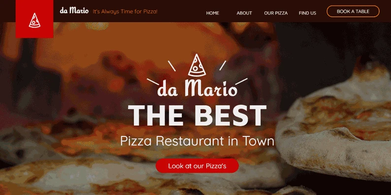
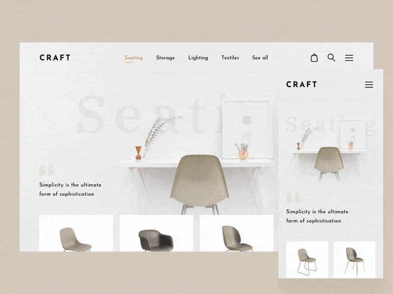
Introduce yourself with your logo
Your logo is one of the most important elements for establishing your identity. People expect to find a logo in a website’s header, and more specifically, they expect to find it in the upper left.
According to another study by the Nielsen Norman Group, in fact, users are more likely to remember brands whose logos are positioned in the upper left than in the center or the right.
#ToDo: insert your logo, perhaps in the upper left-hand corner
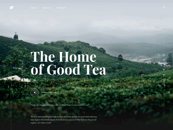
Choose a stunning image
A beautiful image is a must for creating a good impression immediately. Choose your header image carefully: you might decide to use a photo or an illustration, or, if you want something even more eye-catching, a video or an animation. In any case, it should be something imaginative that immediately evokes positive feelings and tells your visitors something about you.
Remember that the image won't be displayed alone in the header: it needs to fit in with all the other elements, including the logo, CTA, and intro text. So choose a clear, high-resolution image that can provide the right contrast with the rest.
Here’s a tip: We all love stories, and we like to see people’s faces: choose photos with faces to spark greater engagement and interaction.
#ToDo: Choose a high-quality image with care.
#InWebSiteX5 - If you’d rather insert an image gallery instead of a single image, with a title and CTA for each one, use the Content Slider Object. Find out how.
Incorporate navigation tools
A good navigation menu is based on an effective tree structure outlining the site’s pages. Visitors should easily understand where everything is and how to immediately find the information they’re looking for.
Make sure the menu isn't overly crowded, and use clear labels: don’t try to be original here, standard names are more immediate and understandable.
#ToDo: organize your site clearly in order to have a functional menu: simple paths allow users to quickly find what they're looking for.
If you'd like to emphasize your content, perhaps by highlighting images or videos, or if you're looking for a minimalist, modern look, you can replace the traditional navigation bar with a hamburger menu: that little button with three lines that displays the entire menu when clicked.
The hamburger button is definitely an interesting solution, especially on mobile, where space is limited and needs to be used wisely. However, it might not be appropriate for online stores, in which case clients need to be able to quickly access products, the shopping cart, and search tools.
#ToDo: Hamburger button: great for minimal, modern designs; not ideal for online stores.
Another interesting solution is the sticky menu: here, the menu is “stuck” to the upper part of the browser window, so that it always remains visible even as users scroll down the page.
Sticky menus are perfect for both desktop and mobile sites, since they provide easy access to all the necessary tools for browsing, purchasing, searching, or contacting the company.
#ToDo: Enable sticky menus to improve users’ navigation experience.
#InWebSiteX5 - Don't know how? We’ll show you. We prepared a guide for working with menus and we developed the Overlay. You can also read the guide to creating a sticky menu.
Write a strong message
An attractive image is important but it’s not enough on its own: support it with short, compelling text that tells your website’s visitors what to expect or what to do.
Choose messages that are simple and easy to read. You can try leading with a title followed by an explanatory subtitle. For large headers, you can use bold and more attention-grabbing fonts. For smaller headers, avoid more imaginative fonts as they may end up being harder to read.
In general, oversized text is a great way to emphasize a title and draw attention to the top of the screen before users start to read the other information present on the page.
#ToDo: write a compelling title in a few, carefully chosen words.
Create an effective Call To Action
You decided to create a website because you have a goal. Are you trying to offer a service, sell products, or gain subscribers? Regardless, your header is the perfect opportunity to ask your visitors to do what matters to you.
Build your CTA (Call To Action) carefully:
- make sure that your site’s graphic elements work together to draw the eye to the CTA;
- the button should stand out: use shapes, colors, and sizes that immediately make it clear that users should click on this element;
- choose the buttons’ text wisely: be clear, direct, and concise. If the action benefits the user, highlight that. Even better, try to leverage feelings of urgency or scarcity.
There’s no rule stating that your header’s CTA should always remain the same. You can test out variants of different CTAs to understand which works best: you can also update the header itself, to correspond to your schedule of special offers, for example.
#ToDo: Create a CTA that users will immediately click.
Make sure that everything also works on mobile
The header, like every other element of your website, should also work perfectly for users browsing on a tablet or smartphone. That means it should be responsive and able to adapt to any device.
So check to see if every element you've inserted into your header will be resized and rearranged to fit smaller browser windows. Remember that some elements may be transformed when viewed on smaller screens (for example, the navigation bar may be turned into a hamburger button), or may even disappear completely.
#ToDo: Check that your header looks perfect on mobile too.
In conclusion
As we all know, a good first impression goes a long way. A well-designed header is a decisive element for a successful website. It’s the first thing users see when they arrive on your home page, and it's very probably also what convinces them to stay, or to exit your page in favor of your competition.
So plan your website header carefully, both for your home page and your internal pages. And keep following us: next, we’ll discuss how to create an equally stunning and effective footer.