OK, the price is right! How to create a pricing page that converts.
Have you ever noticed the following? Often, on the websites of companies that are offering services, software or apps - in most cases, by subscription - there is a page with a special table that lists and compares different customer pricing plans.
- Should you have a pricing page on your website too?
- Why are tables so commonly used to display pricing?
- More importantly, how do you make an effective pricing page?
These are just some of the questions we'll answer in this article. When you finish reading this article, pricing pages will no longer be a mystery to you!
Why is it important to have a pricing page?
Whether you offer painting services, sell coffeemakers or software, the strategy behind your website is the same. The idea is to create a group of pages to present your product or service in the best possible way in order to convince potential customers of the benefits of the solution you’re presenting, and then to guide them into making a purchase.
In this journey, researching prices is a natural part of any customer's decision-making process.
Some customers go immediately to the pricing page: they're comparing alternative solutions and want to know first if your offer is within their budget.
Other customers, however, become increasingly interested in your offer. As they continue to explore further, they also look at your prices and obviously take these prices into account when making their decision.
Whether customers start from your pricing page or if they get there only after viewing the other pages of your website, the point is that in all cases, they will go to your pricing page, and this page will be a decisive factor in whether or not they're convinced to complete their purchase.
Your pricing page offers you a huge opportunity to take control of the conversion process. If you design your pricing page well, making sure that it presents the right information and is easy to use, your sales will increase. If you don't, then unfortunately, you'll lose customers.
So, what does an effective pricing page look like? Let's find out.
Why should you use a table to present your prices?
After presenting a service or a product, there are many ways to tell potential customers about the purchase prices. For example, you could write a text, make a bulleted list or even create a nice image with a list. The point is that a well-organized table is much more effective than anything else.
Think about it. A table:
- offers a clear, uncluttered outline;
- summarizes a lot of information concisely and accurately;
- allows an immediate comparison between the available options.
So, basically, a price table allows customers to inform themselves and then to proceed in a knowledgeable manner and, finally, to make a choice.
And not only that, a price table does something more: it doesn't limit itself to presenting purchase options, but can direct customers towards certain options instead of others. How? By relying on, as we'll see, a number of psychological levers and by wisely using some graphic devices.
Here's what you need to do to create an effective price table.
Step 1. Select your information
The first challenge you'll face when creating a table for your pricing page is selecting the information customers may need to make a decision and to present it consistently.
A few pieces of information may not be enough to earn your customer's trust or to allow them to be confident about their choice. On the other hand, too much information may distract or confuse customers and ultimately discourage them from continuing to read and to make a purchase.
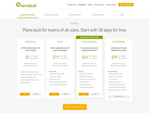
For example, according to research conducted by Hiten Shah and ProfitWell, Zendesk's pricing page tends to overwhelm customers and to make their choice complicated.
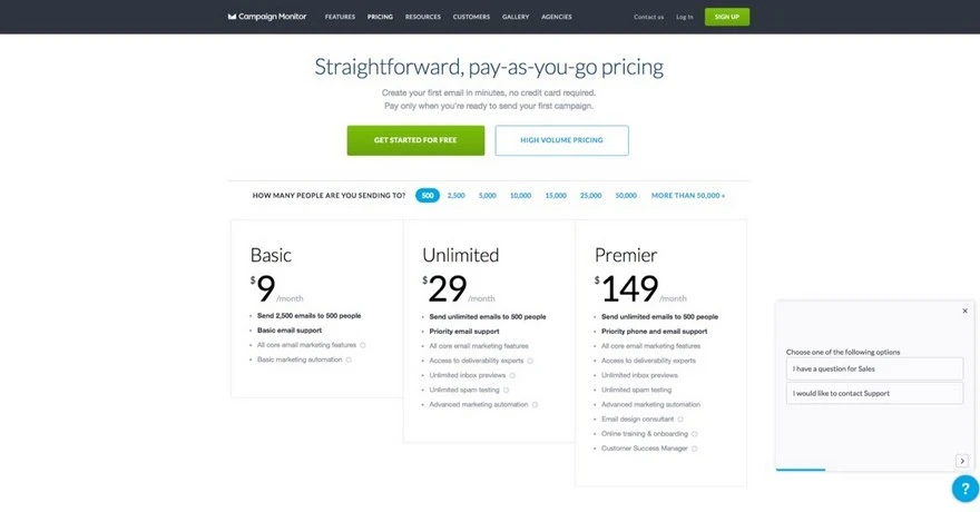
In contrast, according to the same study, Campaign Monitor was able to create a simpler, clearer table that helps customers feel confident that the decision they're about to make is the right one.
While this may be easier said than done, it's important to find the right balance.
Remember, however, that a web page can have several levels of reading. Therefore, you should only include the truly essential information in the price table and make it easy for the customer to understand the difference between the plans. If the services you offer are complex, provide as much detail as you consider useful in a comparison that is included on the page or is linked in another page. This way, each customer can choose the level of detail they want to go to.
Step 2. Defeat indecision
Unless you're relying on luck, making a decision is a lot of work! The problem is that when fatigue gets the best of customers, it can lead to paralysis. In these cases, rather than commit any further, customers choose not to decide, and therefore chose NOT to buy, perhaps postponing their decision until a later date.
The first step toward avoiding this risk is to realize just how real it is.
What can you do to make your customers' decision-making process easier? Try starting here:
- Narrow down the choices
On most pricing pages, the tables present three alternative plans. It's true that having more choices is appealing, but it's also true that this could end up making the evaluation more difficult: and that's exactly what we want to avoid. - Clarify the context
Customers may think that your product or service is "expensive," but ... compared to what? If you allow them to compare to a much more expensive option, the other options will seem more appealing. That's why you should try to go against the grain and sort your plans from most expensive to cheapest. Presenting the most expensive option right away may create a small shock, but the middle and lower tier plans will look excellent by comparison. - Give them a little push
One of the most effective ways to get those who are hesitant about making a decision is to play on urgency. By emphasizing scarcity (for example, with an offer which is only valid for a certain time or for a limited number of products) you can increase the pressure on customers to act before it's too late. - Offer a free plan
We've already explained that not every customer who comes to your pricing page is ready to make a purchase. That's why you should provide a free plan. By removing the price barrier, you'll allow customers to freely evaluate your offer and come back later to buy. If you can't provide a free plan, consider offering a trial version of the different paid plans anyway.
Step 3. Choose the right words
We get it: creating a good pricing page is critical to growing your sales. Not only is it important, as we said before, you must select the right information. It is equally important that you express and present this information in the best possible way.
So, keep these tips in mind when writing your texts:
- Sell value, NOT products
People are interested in drilling holes, not in knowing everything there is to know about drills. Avoid clichés or generic phrases and don't just focus on the features of your product or service. Instead, try to highlight the problems you solve and the benefits for your customers. - Every word counts
The names of the different plans also play a role. For example, you can do what Bidsketch has done and assign names to plans that reflect your customer segments - this will help people find the right offer for them more easily.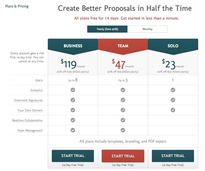
- Drive the action
Don't underestimate button texts. Choose action verbs: clearly tell your customers what you want them to do, and try to emphasize the action (e.g., "Add to cart") or the benefit they can get from the action (e.g., "Download e-book").
Step 4. Pay attention to the graphics
Summarizing what has been said so far, you already know that your price table should have three levels, or a few more, possibly ordered from the most expensive to the cheapest, including a free level.
To make life easier for your customers, it's a good idea to identify a recommended plan and to highlight it.
The most common ways to do this involve leveraging:
- colors
- sizes
- banners
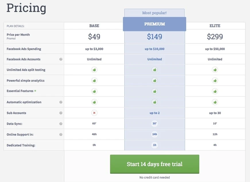
On its pricing page, for example, AdEspresso highlights its Premium plan by using a contrasting color, an oversized column, and by adding the words "Most Popular."
Step 5. Complete your pricing page
So far, we've mostly focused on tables that display the plans, but pricing pages also include other elements.
Here are a few that you shouldn't miss:
- Reassurances
You're asking a potential customer to trust you and to make an online purchase. Under the prices, you should include elements that reassure potential customers about the benefits of your service or product, as well as about the security of transactions. So, you could add information on how popular your service is, instead of guarantees, such as "free returns" or "30 days money back." - FAQ
Be proactive and prepare a set of FAQs that answer the most common objections or inquiries you might receive. By answering these objections now, you'll encounter less resistance and help potential customers to buy more quickly. - Contact information
Now that your beautiful pricing page has "warmed up" your customers, at this point, it takes very little effort to convince them to buy, if they haven't already done so! Consider providing a chat service on your page: a quick question and a prompt answer could be all that's needed to make the sale happen.
Create your pricing page with WebSite X5
Now that you know what the reasoning behind an excellent pricing page is, you just need to put it into practice. If you're wondering how to do it, WebSite X5 has everything you need to create a foolproof pricing page.
In particular, for the price table, we suggest using the new Optional Pricing Table Object. Then you can manage the FAQ section with the Accordion Text/FAQ Optional Object and, finally, you can take advantage of the LiveChat Optional Object when offering a chat service.
Don't be satisfied with the first version: create, test and measure. Try making small variations on proposals, colors, texts, etc. Over time, you'll learn how to create the best version of your pricing page, the version that will help you to sell more.