How to create a Landing Page
Published by Incomedia in Guides and Tips · Thursday 27 Jun 2019
Have you ever heard of a Landing Page? I’m sure you have.

Landing Pages are a vital web marketing tool and if you have a website, blog or an e-commerce store and you are trying to boost your online presence, you may have wondered how to create an effective Landing Page or how to optimize it for a higher conversion rate.
In this article, we will answer the following questions:
At the end of this article you will also find many examples and case studies, which are very useful as a source of inspiration and as a way to move from theory to practice.
What is a Landing Page?
In general, we could say that a Landing Page is any web page on which a user arrives after clicking on a link.
In reality, in web marketing this definition is not very precise. In fact, a Landing Page is different from other pages because it is created with a very precise goal in mind: to perform a specific and measurable action towards users by “transforming” them or, rather, converting them from just being visitors of the website into leads (contacts) or into customers.
A Landing Page is a web page on which users land after having clicked on a link and whose purpose is to get users to perform a specific and measurable action, converting them from just being visitors into leads (contacts) or into customers.
Here’s how it generally works: users click (or tap) on an advertisement or an email and land on a Landing Page which is usually a page that is “detached/separated” from the website to which it refers. There are no distracting elements on the Landing Page and everything is designed so that users can do only (or almost only) the action for which the page was designed: to leave their email, buy something, read certain content, to put a like on something... When the user completes the action, the conversion takes place: someone who is just a visitor, about whom little or nothing is known, turns into a contact (that is, a person who can be contacted because, for example, you have their email address) or a customer (that is, someone who has already made a purchase).
Which are the main kinds of Landing Pages?
Landing Pages, can have two different conversion targets:
- to get new leads;
- to get new customers.
In the first case, we’re talking about a Lead Page, in the second, a Click-Through Page.
In addition to their purpose, Landing Pages can also be classified according to the type of content they point to. According to this point, three interesting categories are: Long Form Landing Pages, Video Landing Pages and Interactive Landing Pages.
And finally, for the sake of thoroughness, let’s not forget Microsites.
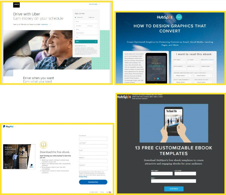
1. Lead Page for Lead Generation
The purpose of these pages is to collect new contacts for potential customers who show a certain interest in the product or service offered, so that they can be contacted again and possibly transformed into satisfied customers.
The central element of these pages, therefore, is the contact form, which you can use to collect data from visitors. This form is usually located at the top of the page, so as to be easily accessible, never too long and limited to requesting only the necessary information, in order not to discourage the user.
Usually these pages offer users a small reward to encourage them to leave their email address, such as an ebook to download, a discount on their first purchase, etc.
Lead pages, especially if they have an incentive, are an extremely effective marketing tool. Here are some examples:
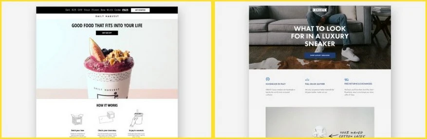
2. Click-Through Page for sales
These pages are an intermediate step between the advertisement the user has clicked on and the e-commerce cart. They provide additional information about the advertised product or service, highlighting its benefits in order to convince the user to buy it. The ultimate goal, in fact, is to sale.
The main point on these pages is the (CTA or Call to Action) button that leads to the e-commerce page where the purchase can be made. Very often, the CTA is repeated in several places and is the only way to exit the page.
In order to avoid distracting the user’s attention, a Click-Through Page should be focused on a single product or service. Ideally, if we have more than one product, we should provide a landing page for each product.
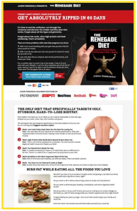
3. Long Form Landing Page
As the name indicates, these are very long Landing Pages and essentially contain text. Their purpose is to make sure that users read the page to the end and gradually become convinced of the value of the offer, until they click on the CTA on the page.
The key to success of these pages is in the copy. Titles and texts must be artfully written in order to “hook” and guide the reader through a line of reasoning, lists of advantages and testimonies all the way to conversion. This type of text, while continuing to repeat the benefits of the product or service, can be very effective in leading users to purchase when they are already inclined to do so, but need one last small push to decide.
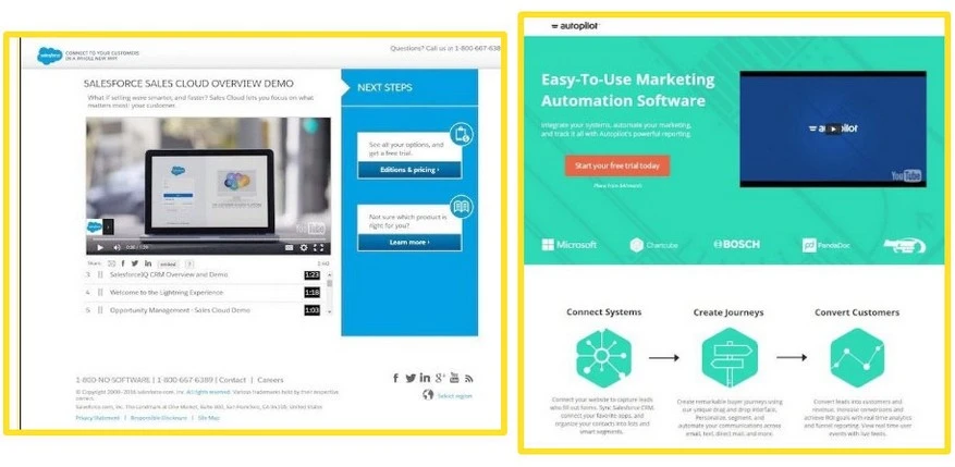
4. Video Landing Page
Again, the name explains exactly what this kind of page is, that is, the central feature of these Landing Pages is a video.
Videos have the advantage of entertaining people, this increases the time they spend on a page so that the message has a better chance of being received. Often, people would rather watch a video rather than read text.
The result is that Video Landing Pages often convert particularly well.
5. Interactive Landing Pages
Landing Pages contain a game, quiz or other content that users can enjoy interacting with. They are not as popular because they are more complex and expensive to make, but like Video Landing Pages, they can lead to very satisfying results.
People are usually happy to sign up if they can take part in an experience that is rewarding for them and, once engaged, they are willing to spend more time on the page than they would otherwise.
Finally, you have to consider that this kind of content, as well as videos, is easily shared on social networks and has a good chance of going viral.
6. Microsites
Instead of using only simple Landing Pages, more complex advertising campaigns with substantial budgets use real microsites that are independent from the reference site. Sometimes these sites have their own domain.
Microsites have the same purpose as Landing Pages. They also try to create a meaningful experience around the product or service they offer and use more than one page to get the message across.
What is the best type of Landing Page?
There is no single answer to this question. You can’t say that a certain type of Landing Page is the best or the most effective of all. You can only say that it is effective with regard to the product or service it offers, the audience it targets or the stage of the purchasing process into which it fits.
For example, very expensive or luxury products do not lend themselves to impulse buying. People want to be well informed and they consider carefully before making a major purchase. In these cases, therefore, speeding up the process too much by focusing immediately on a Sales Landing Page could be a mistake. It’s better to try to get contacts through a Lead Page and then try to gradually convince users of the value of the product or service in order to guide them into making a purchase.
In other circumstances, however, users may already be convinced that they need a particular product or service, so a Landing Page that offers a direct purchase is the best choice.
What are the key elements of an effective Landing Page?
Landing Pages can be very different from one another in terms of the content, how it is organized, the graphics and colors used. However, successful Landing Pages, that is, those that deliver good conversion results, all share a number of common features:
- They have a single, specific and measurable purpose
- They target a specific audience
Generic Landing Pages can be less persuasive. It’s better to create different Landing Pages, each designed for a specific user group. - They present all the necessary information
A Landing Page must be autonomous. Users must find all the information they need to decide to take the desired action, without feeling the need, for example, to search elsewhere for more information.
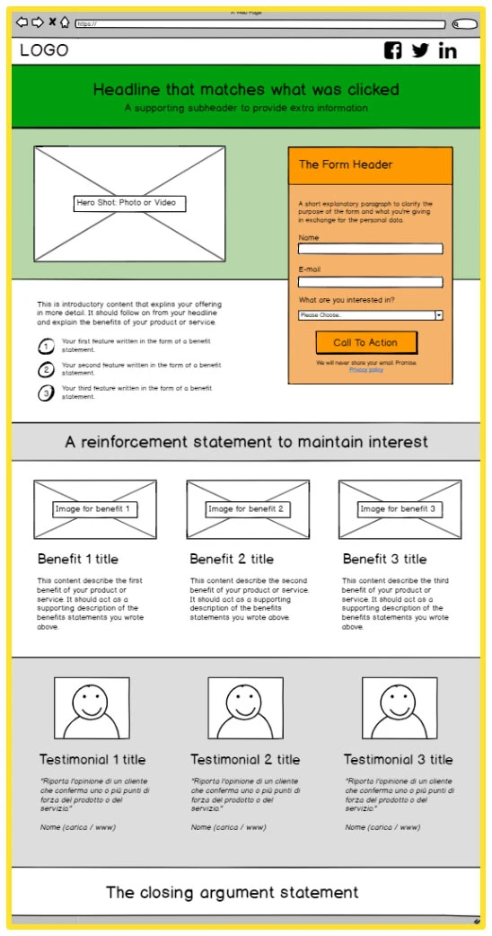
Beyond these general features, when looking at Landing Pages that work, it becomes clear that they are composed of a number of recurring elements. Let’s take a look at these elements.
Logo
When subscribing to a newsletter or buying something, people need to know who they’re connecting with. A logo identifies the company and gives credibility to the campaign.
Title and subtitle
Every Landing Page must have a title. The title must be consistent with the promise made in the advertisement on which users have clicked and it must make them understand that the page will provide an answer to their need. Therefore, the title must summarize, in a few words, what the Landing Page intends to communicate. The title can be followed by a subtitle that enhances and validates the title.
Because of its position and size, the title is often the first, or one of the first elements the reader notices. So, don’t be satisfied with using the first title that pops into your head, instead, look for the best formula for engaging readers, intriguing them and urging them to go further.
Featured image or video
Because a Landing Page must capture the user’s attention along with attractive title, there should be an attractive image of the product, service or proposed benefit or - even better - a video that presents the main features.
It’s important to use relevant and professional quality images. An attractive image alone may not be enough to make a sale, but a bad image can certainly contribute to losing a sale.
Registration forms (Form) and Call to Action (CTA)
These are, of course, elements on which the attention of users must be directed in order to get them to perform the desired action, such as filling out a registration form or clicking on a button to make a purchase.
If you have a form, it must be clearly visible, possibly near the top of the page, and it must be brief and easy to fill in. Nobody wants to waste time filling in the fields of a form, so we have to make sure that filling it out is as pleasant as possible.
The Call to Action is the most essential element on each Landing Page, where we explicitly ask the user to do something. To create an effective CTA, insert it into a button that stands out because of its shape, color and size. Place it in a strategic position on the page and write the text carefully.
List of benefits
Users are not as interested in the characteristics of your product or service as they are in the benefits they can receive from it. When users look at the Landing Page, they think, “Do I really need this?”
You need to look at it from the user’s point of view. Identify what benefits they can gain from the proposed product or service and clearly list these benefits in order to convince them that the product or service precisely meets one of their needs.
A well-made list of benefits, perhaps accompanied by the appropriate icons, helps to reinforce the concepts expressed in the introductory text, which is usually located just below the title.
User feedback and reviews
Before making a purchase, we tend to get advice from people we know or look for reviews from other users. This is why you should include user reviews on your Landing Page.
There is no need for a lot of reviews, but they must be well done. It’s better if they are short and clear, especially if accompanied by the photos and names of the people who provided the reviews.
In addition to testimonials, there are other elements that you could consider using to help create user confidence: awards received, logos of newspapers that have written about the product or service, “Satisfied or refunded” or “30-day warranty” badges that apply to the offer, etc.
Social Buttons
Social buttons are not an element that contributes to the purpose of the Landing Page. However, allowing to share opens up the possibility of reaching other potentially interested audiences - the audience made up of the social contacts of the people who visit the Landing Page and find it interesting.
Navigation menu
We left this for last because, unlike all the other elements that should not be neglected, the navigation menu should NOT be on a Landing Page.
In fact, the links in the navigation menu could provide an escape route for visitors. So, it’s better to omit these links in order to keep visitors focused on completing the desired action.
How do I measure the effectiveness of a Landing Page?
How do you know if a Landing Page really works or if it could be improved to obtain a higher number of conversions?
The reality is that you can’t be sure until you try it. The method used for knowing which changes can lead to higher conversion rates is called an A/B test or a split test.
The A/B test involves creating two versions of the Landing Page in which one variable is different, the one that is assumed could affect the behavior of users.
In general, the elements that are tested are the title, copy, the background or product image, the colors and the CTA.
All must be used for the same period of time on a similar audience. Finally, by measuring the conversion rate (i.e., the ratio between the number of visits and the number of conversions), you will know which of the two versions of the Landing Page works best and you can start, if you wish, a new A/B test on another element.
As you can see, creating a successful Landing Page often requires a process of improvement by trial and error.
Examples of Landing Pages
Analyzing successful Landing Pages made by others is a very useful way to start mastering the underlying mechanisms of this marketing tool.
Leadpages, Unbounce and Instapage, three of the most famous services dedicated to the creation of Landing Pages, present collections in which they explain, for each page examined, what works and what should be improved.
- See the 100 best examples of Landing Pages according to Instapage
- Discover the top ten best Landing Pages of 2018 by Leadpages
- Read the analysis of seven inspiring Landing Pages from Unbounce
Conclusions
If you’ve come this far, it should be clear to you what a Landing Page is and why you should use one. You should also understand what you need to work on to create a successful Landing Page and that there is no magic recipe to follow. Instead, you’ll have to be “strategic” and “scientific” by setting goals and being willing to test, measure and change your Landing Page until you’ve found the solution that gives you the best results in terms of conversions.
Now it’s up to you. Have you ever thought of creating a Landing Page to promote your products or services? You can do it with WebSite X5, the perfect software for creating Websites, E-commerce sites, Blogs and - why not? - Landing Pages.