What are the best fonts for the web?
Published by Incomedia in Web design · Thursday 23 Jan 2020
Once you decide to make a website, you need to use the right software to help you create the various pages. In particular, this software should place the right emphasis on design aspects. A key part of this process is choosing the right fonts for a website, for at least two reasons: in order to present yourself professionally, and to make sure that the text in all your pages is clean, legible, but also original and aesthetically pleasing. But what are the best fonts for a website? Let's find out.
Website fonts: the main categories.
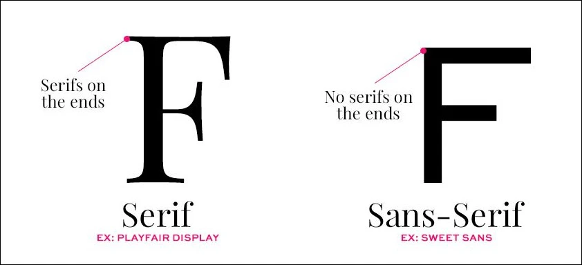
When you choose a font for your website, you need to consider the various font "families": in general, we all use the two or three most common ones, but this really is a decision you should make carefully. Here are the two main categories: "Sans serif" and "Serif".
Fonts for professional websites: Sans serif
Sans serif fonts are the most popular overall, because they are simple, linear, as well as modern and innovative. "Sans serif" means "without flourish", meaning that the letters' strokes aren't extended out: this makes them perfect for use in a professional website, because the resulting text looks clear and clean. The main sans serif fonts are:
- Arial, a modern font with soft lines;
- Futura, a font used by very famous brands;
- Helvetica, another very popular font in the world of advertising.
Fonts for photography portfolios or other creatively-focused websites: serifs
Unlike the fonts listed above, serif fonts do have "flourishes". This makes them ideal for a photography website or for a broad range of other creative activities. In general, they're perfect for titles and headers, which are usually larger in size.
That's because the increased size makes them more legible, while they're less suitable for text blocks as they can be tiring to read, especially if you use them for a mobile site. The most common sans serif fonts are:
- Times New Roman, which we've all used at least once;
- Bodoni, a clean and elegant font often used for logos
Website fonts: other examples
Choosing the right font for a website also depends on the type of company and target audience: the font you would use for a photography website, for example, can be more unique and artistic, while the best fonts for professional websites, like those of banks or other institutions, should be more simple and elegant.
What's more, these days you should also make sure that you choose a font that's suitable for a mobile website, meaning text that also looks clear and legible on mobile devices.
Finally, let's talk about other, more "niche" web fonts:
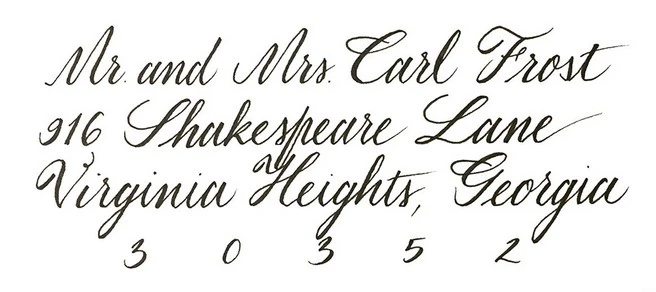
Calligraphy
These fonts mimic the look of handwritten script, and they can also be great for professional websites, at least for page titles, because they add elegance and style.
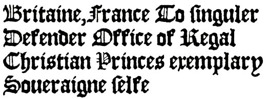
Gothic script
A fascinating choice, they evoke ancient writing, since they are derived from the Greek or runic alphabets. Old English is the most widely-used of these.
Although they're elegant, be careful when using these fonts for the web, as the tight spacing between letters and the fact that they're often bold can make them difficult to read.
Web Fonts and how to use them
Now that we know all about the most common font types, including the large number of possible solutions out there, we still need to understand how to integrate the fonts we like on our web pages. There are many strategies to follow, and one of the most popular ones is relying on Google Fonts.
To put it in a nutshell, Google Font is a service offering a vast archive of ready-to-use Web Fonts: these fonts are stored on Google servers and are then simply loaded on the web pages using style sheets. With WebSite X5 you can very easily integrate and use Google Fonts on your projects. Find out how to do it: watch this video or read the article "How to add a font from Google Fonts".